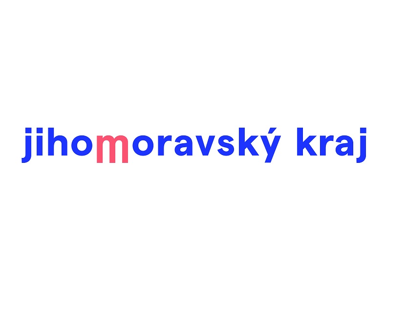
The new logo is based on traditional colours and shapes inspired by Moravian ceramics, costumes and architecture.
Brno, Dec 17 (BD) – The South Moravian Region decided to update its logo and visual identity after eight years. Following an open competition, a proposal based on simplicity, minimalism and timelessness, with foundations in Moravian folklore, was selected. The central element of the new logo is the letter “m”, often associated with the region and places such as Mikulov, Macocha, and Moravský
“We opted for a change on the basis of the independent opinion of experts, who recommended a more modern concept of communication, including a change in the region’s logo. I am satisfied and I believe that through this modern visual style we will be able to present what the region is doing, its priorities and, in particular, that there is a unified communication between the region as an administrative unit and the region as a destination brand,” said South Moravian Governor Bohumil Šimek.
A special committee, composed of representatives of the region and experts, selected six proposals from four agencies and eventually chose the design prepared by the DORLAND agency.
Based on the requirements of the region, DORLAND created two logos and two visual styles, including manuals (South Moravian Region and South Moravia). The logo and visual manual of the region cost CZK 550,000; the logo and visual manual of South Moravia as a destination brand cost CZK 470,000. “The logo is just the beginning, there is still a lot of work ahead of us,” added Šimek.
The region uploaded a video presenting the new visual style on their Facebook page last Thursday. The video had over 10,000 views in the first day following publication.
Mixed Reactions From the Public – Compliments, Criticism, DIY Parodies
The day after the release of the video, following a lot of emotional reactions from the public on social media, the region published an official text explaining the new visual concept, the selection process, and the price. “The new logo of the South Moravian Region unleashed passion and emotion. We were expecting that and we are glad. […] In the discussions about the new logo, a substantial inaccuracy has been repeated and spread further. It’s the price of a new visual style for the South Moravian region. That is why we feel the need to put it right,” the region stated on its Facebook profile linking to the text.
Reactions from the public were mixed. Many gave “thumbs up” to the new modern look of the region’s visual presentation, while others focused on the price, describing it as excessive. A large proportion of the people reacting simply disliked the new visuals, others were confused, and others made fun of it.
Instead of commenting, many took things into their own hands and got creative. One reader photoshopped the central “m” into a shape similar to the logo of energy drink company Monster. Another reader replaced the “m” with the head of a popular character from the series Futurama, Dr. Zoidberg. Yet another post suggested a logo copying the style of the website PornHub.
Get the news first! Sign up for free to our daily newsletter here. Top stories of the day in your mailbox every morning.